&Smyth
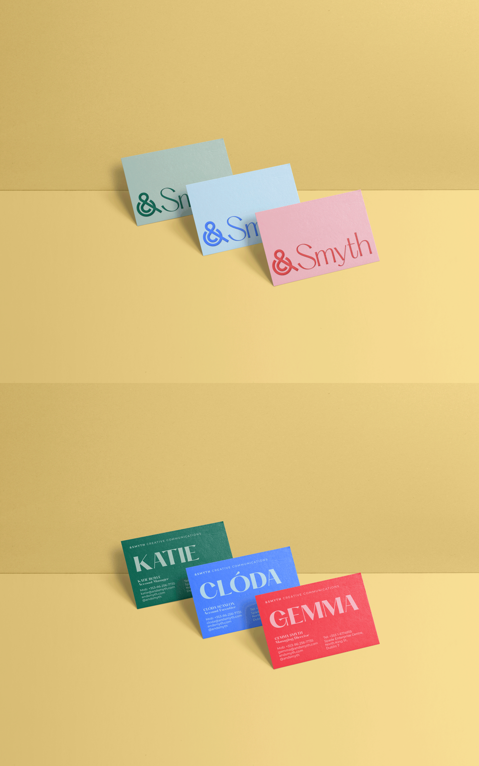
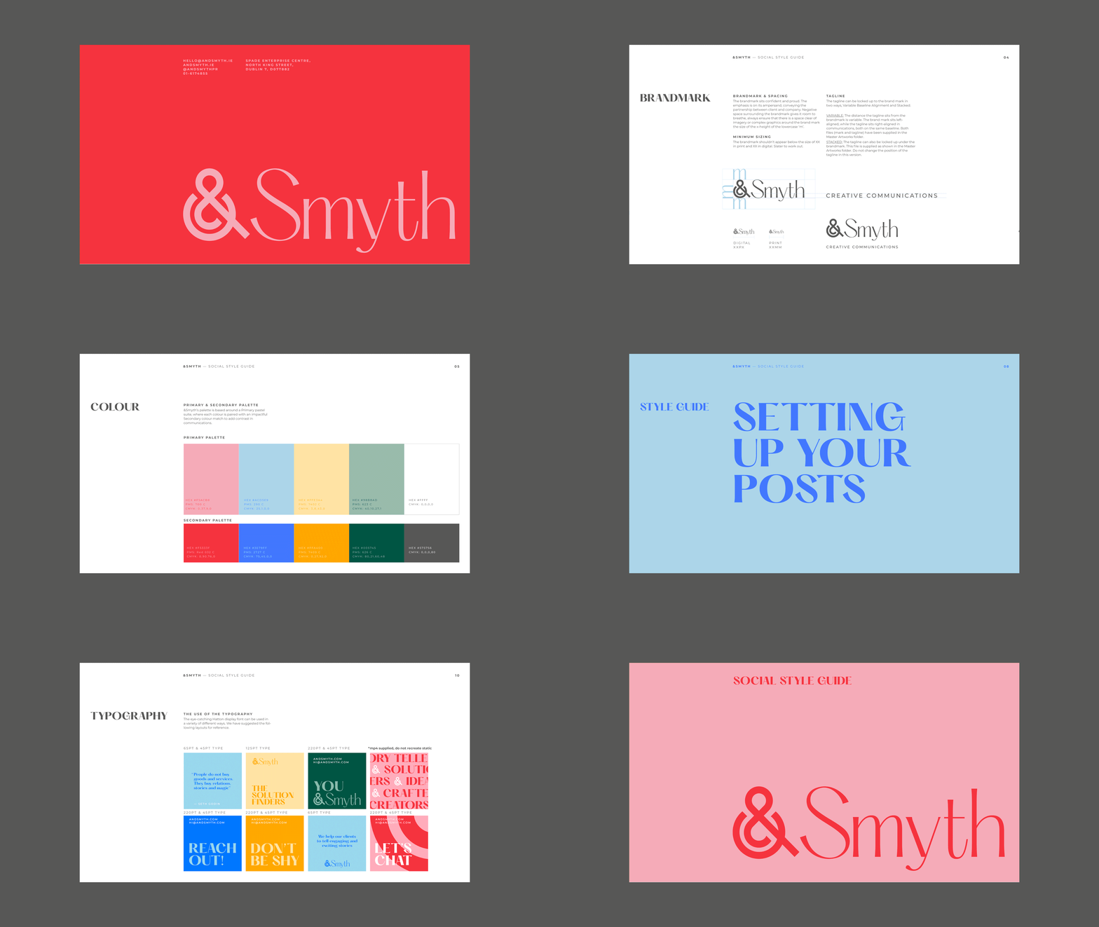
&Smyth are an Irish PR company who came to Slater Design with the hopes of updating their brand identity. My creative route was chosen and developed.
The ampersand is a symbol of development and growth, it represents partnership and unity. It was only fitting that a bespoke geometric ampersand was created, taking its inspiration and influence from old Irish triskeles.
-
I created and completed this work at Slater Design, and creatively directed by Emma Wilson. Photography in use is for example purposes only.
-
Brand Identity
Digital
Print


Stationary Suite

Business Cards

Social Feed

Social Style Guide
