
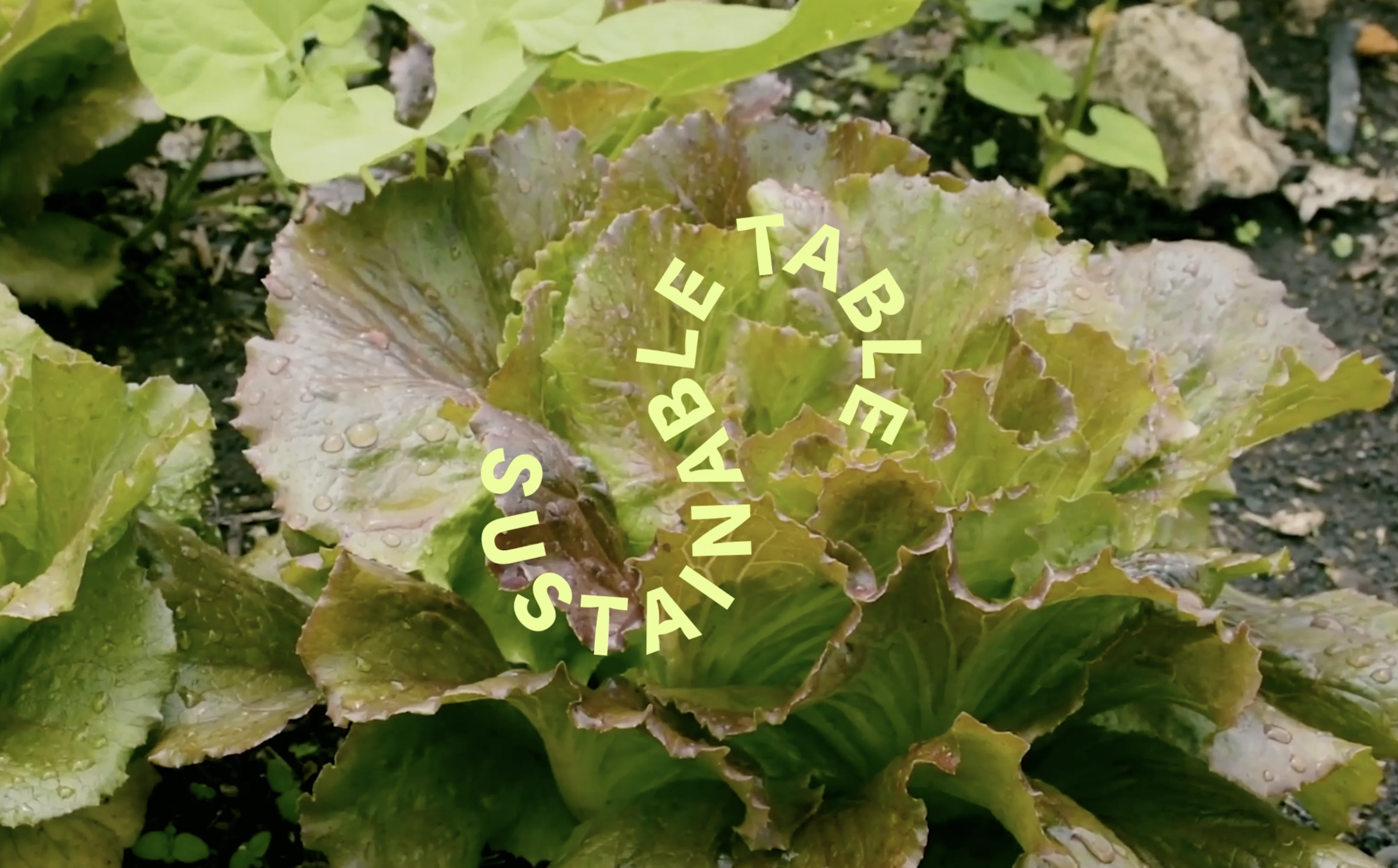
Sustainable Table
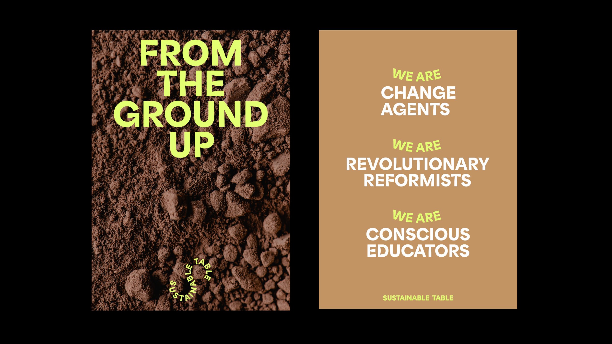
Sustainable Table are change agents for Australian farming and food systems. The brand identity was created to reflect the winding journey towards transformation, visualised through the use of typographic movement and organic paths.
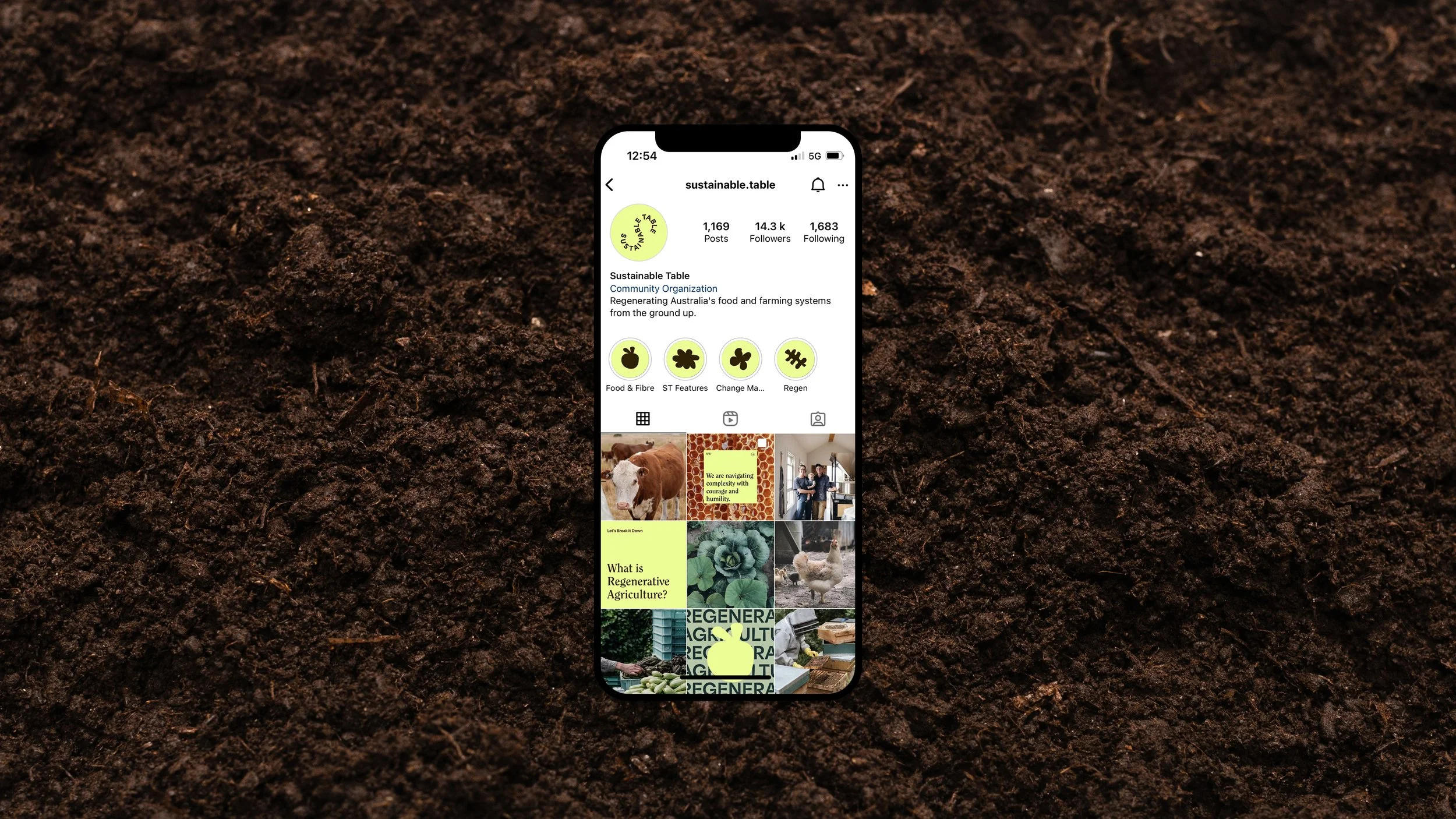
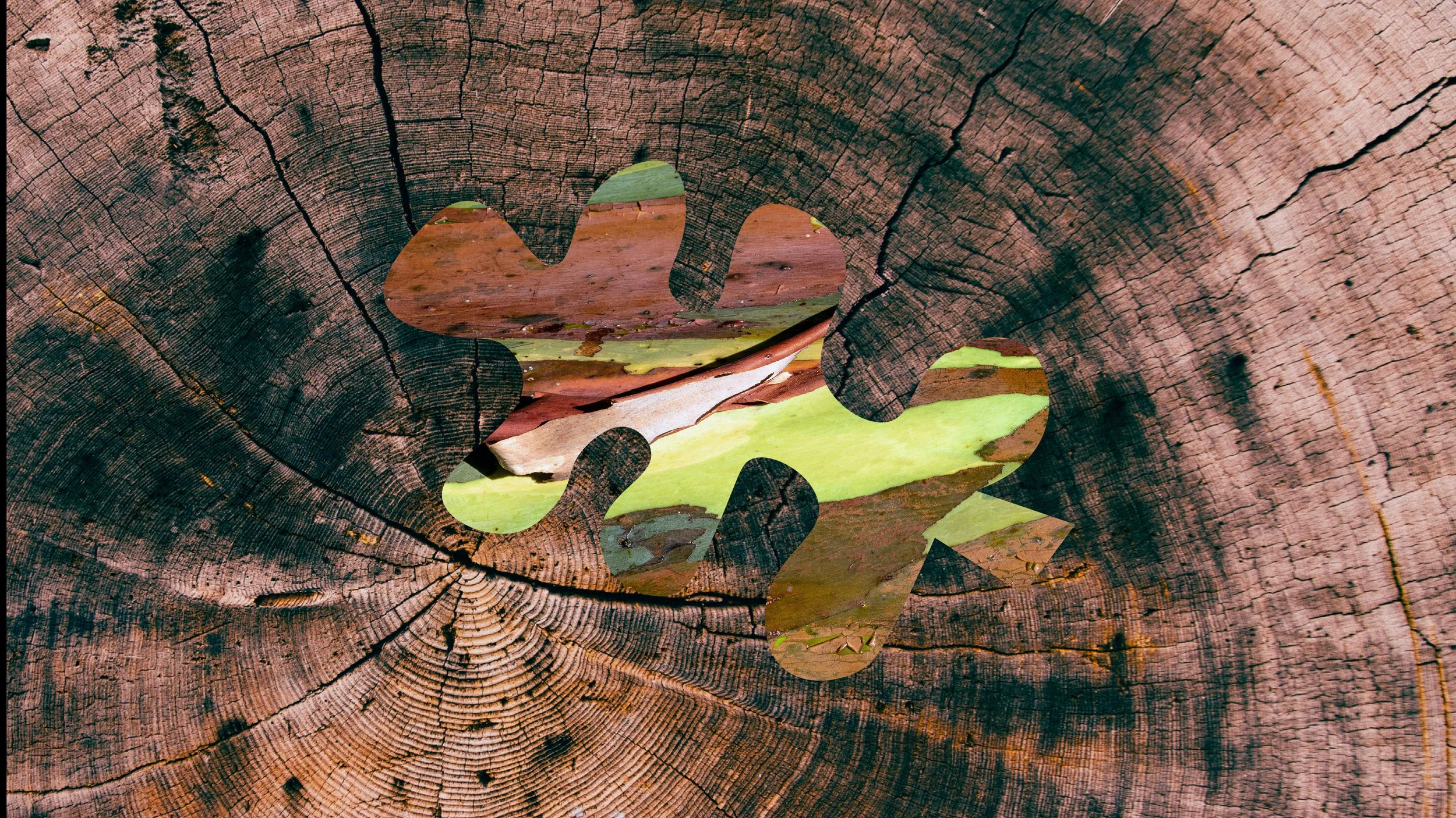
The brand mark was inspired by the circularity of nature and the idea of regeneration. Rounded geometric forms link together to create an ‘S’ that represents the regenerative focus of the organisation, with a subtle nod to the infinity symbol.
The site was designed to house valuable educational resources for farmers, funders, and communities to help them understand the importance of regenerative agriculture and how they can take part in the evolution of the broken system.
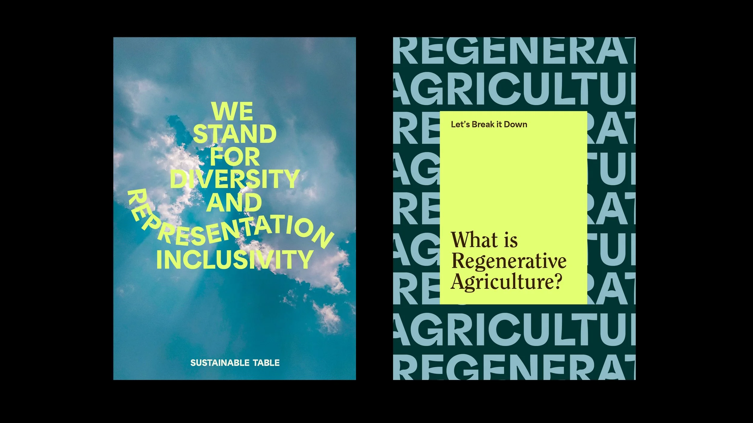
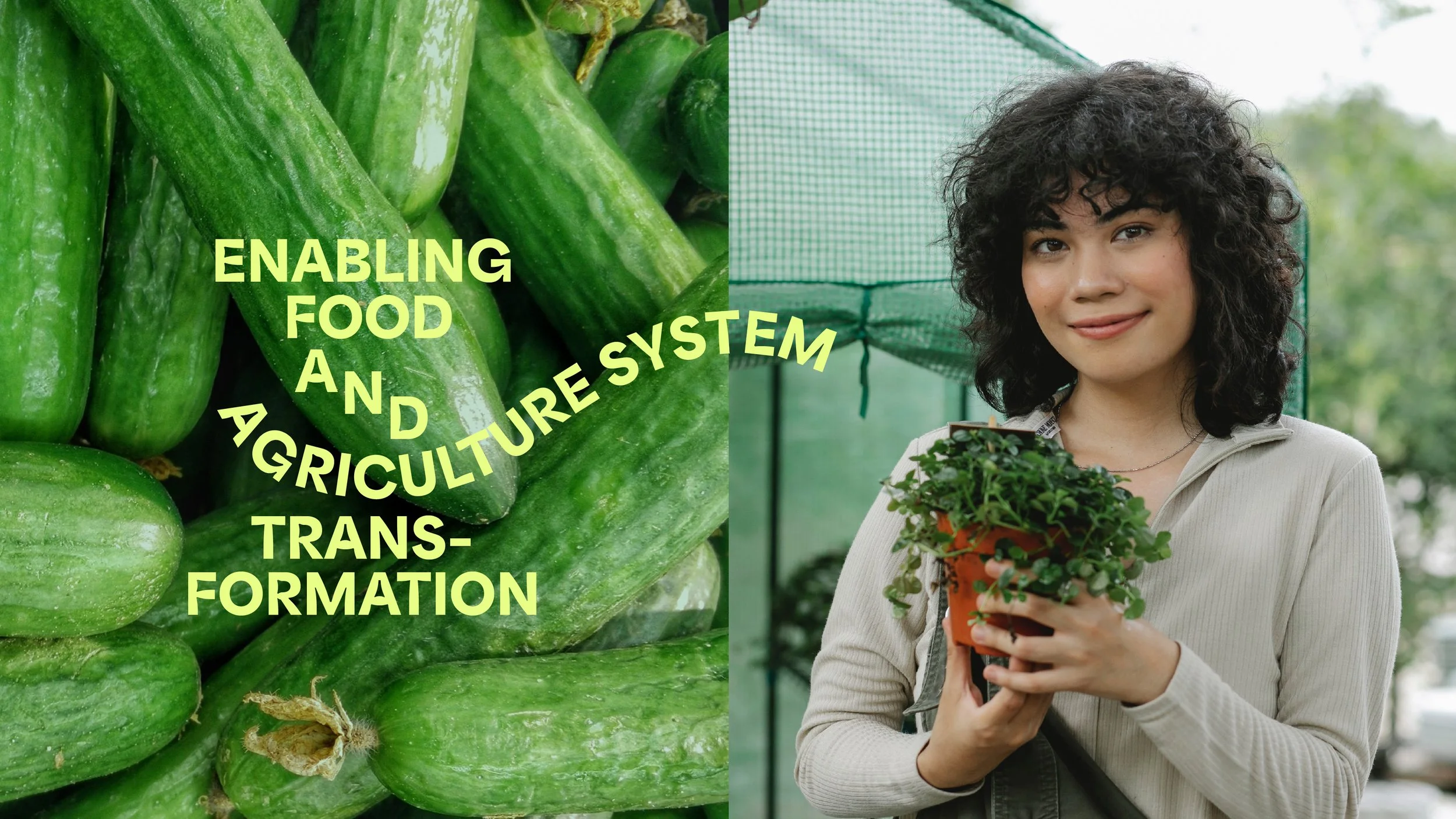
The brand’s visual language is centered around imagery that creates contrast and connection between people, land, agriculture, and industry. Powerful, bold colours, and confident typography were used to highlight the urgency of the issues Sustainable Table addresses and their willingness to speak out. The secondary and tertiary typographic language is gentler in its approach, providing a balance between making strong statements while remaining friendly and encouraging.
-
I created and completed this work at A Friend of Mine, Melbourne, and was creative directed by founder Suzy Tuxen. Imagery is sourced from Pexels and Unsplash used as an indicative example of tone.
-
Brand Strategy
Brand Identity
Website
Social
Illustration
Animation

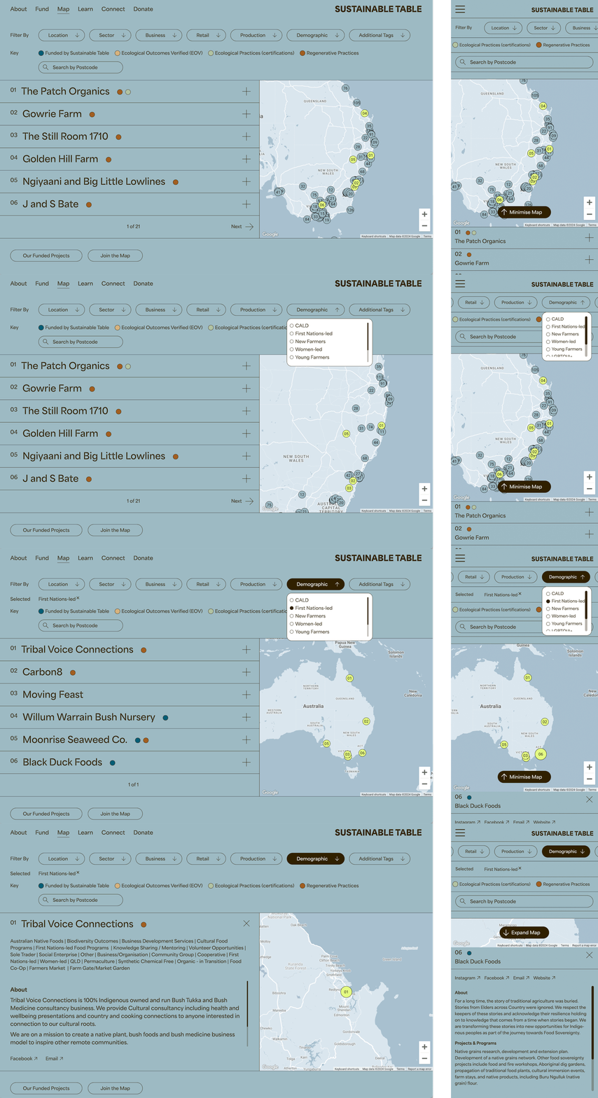
Regenerative Farming Map
Connecting Regenerative Food & Farming Projects across Australia
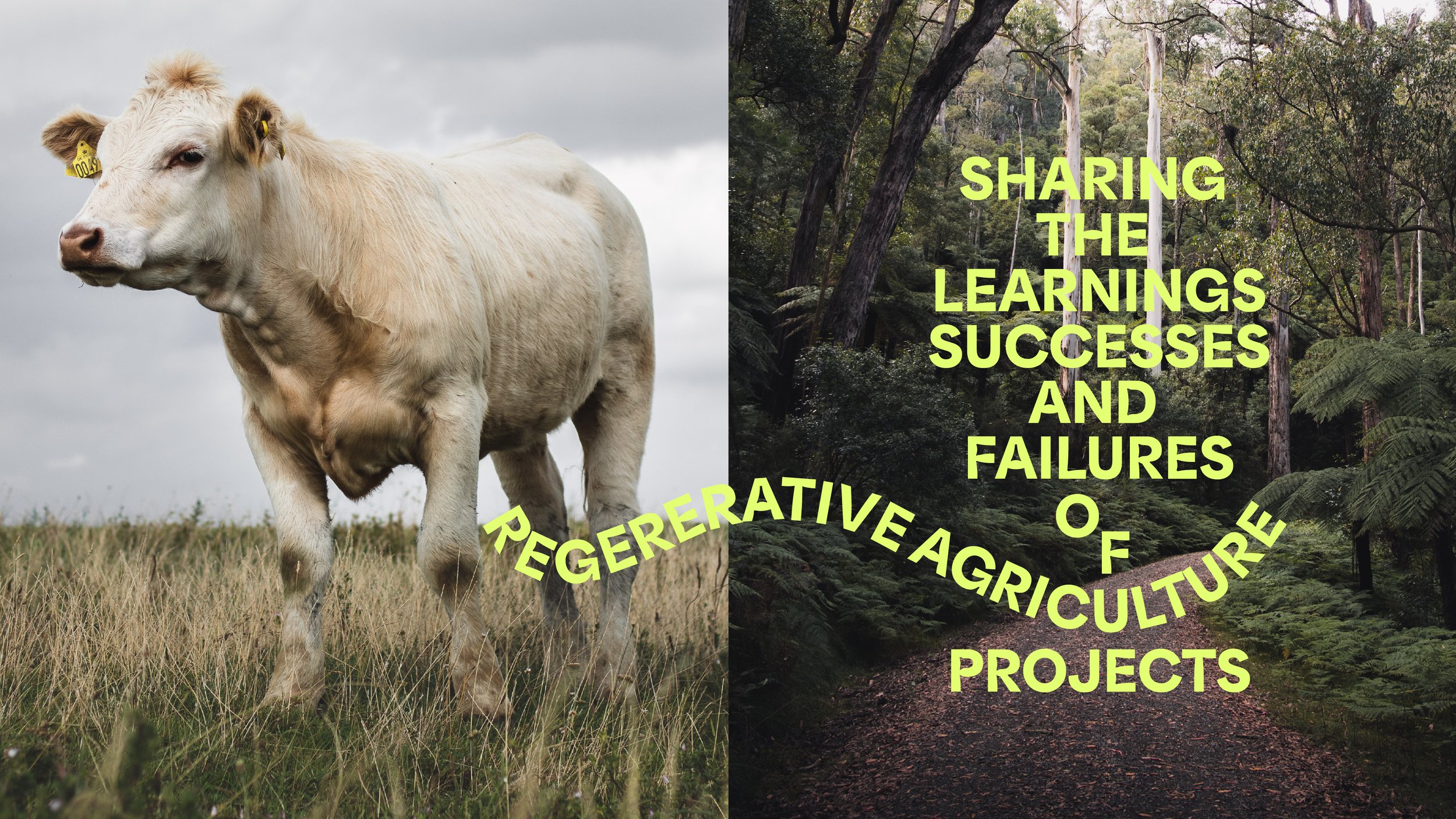
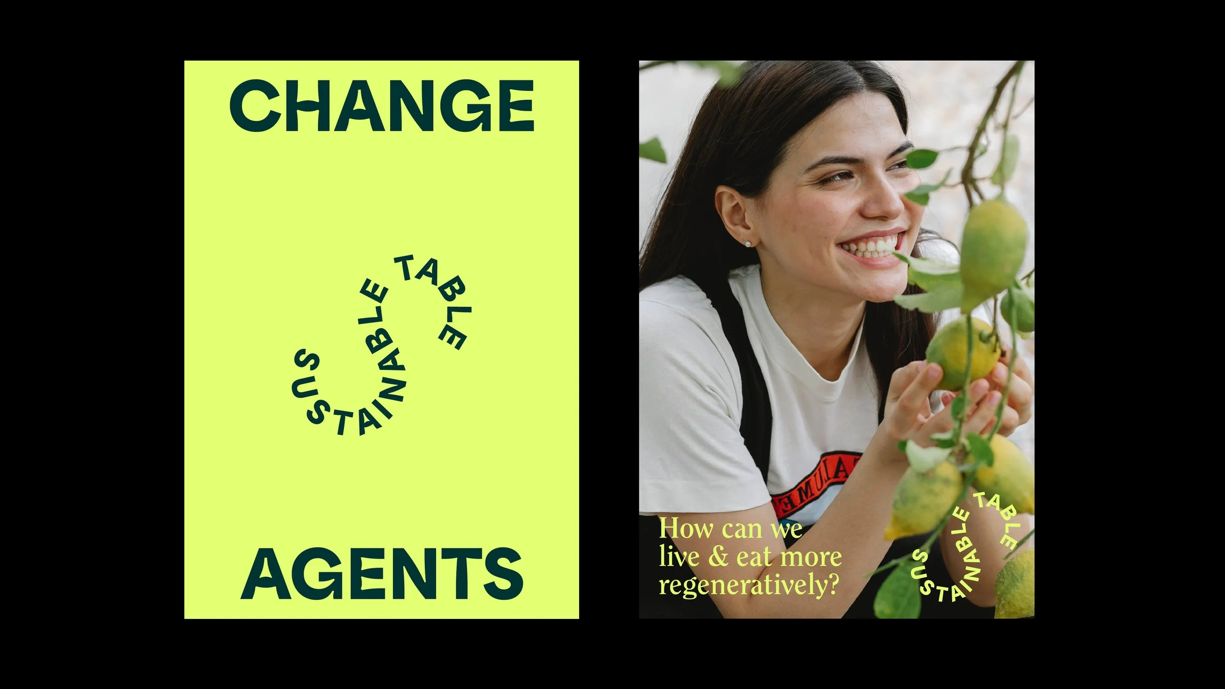

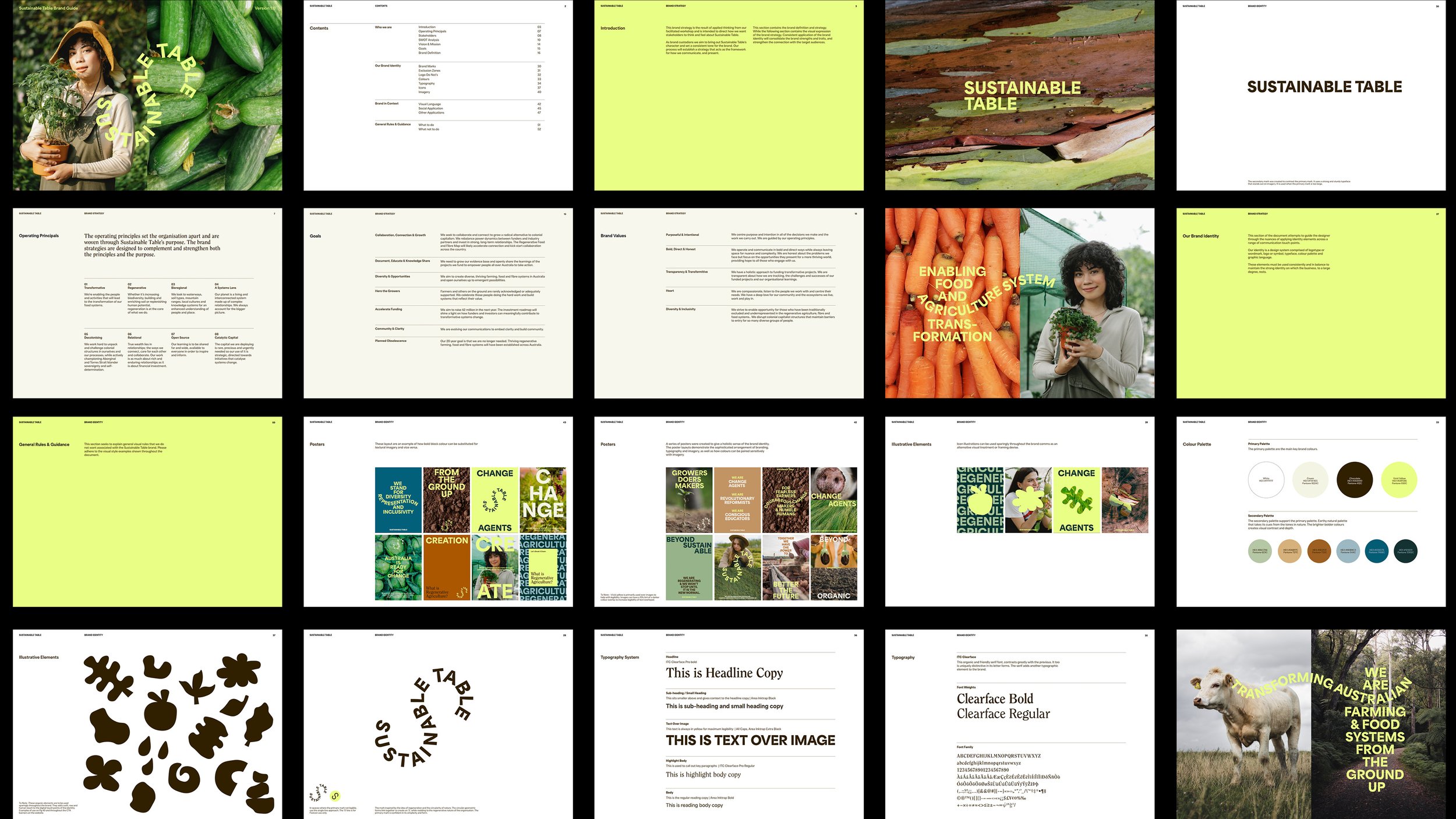
Spreads from the brand guide