Pembroke Montessori
Sinead, the founder of Pembroke Montessori wanted to create a brand that spoke to the school’s expertise and quality. I wanted to create an identity that was child-like but not childish, I didn’t want to rely on the bright bold primary colours that you often see in children's branding. The Montessori is homed in a beautiful Georgian building, bursting with character. I was inspired by the beauty of the building and it was the basis for the identity.
The crest mark was a fitting symbol, in keeping with the elegance and history of the building. The crest shape was flipped upside down to represent the door of the building being open for the next generation of learners and thinkers.
-
I created and completed this work at Slater Design, and creatively directed by Emma Wilson (CD). Photography in use is for example purposes only.
-
Brand Identity
Digital
Web
Signage
Car Wrap


The logo mark suite was created so it could live in a variety of different spaces, from montessori uniforms, to afterschool uniforms to social platforms.

A series of posters were designed to sprinkle elements of the brand throughout the building.


Website (press play to scroll)

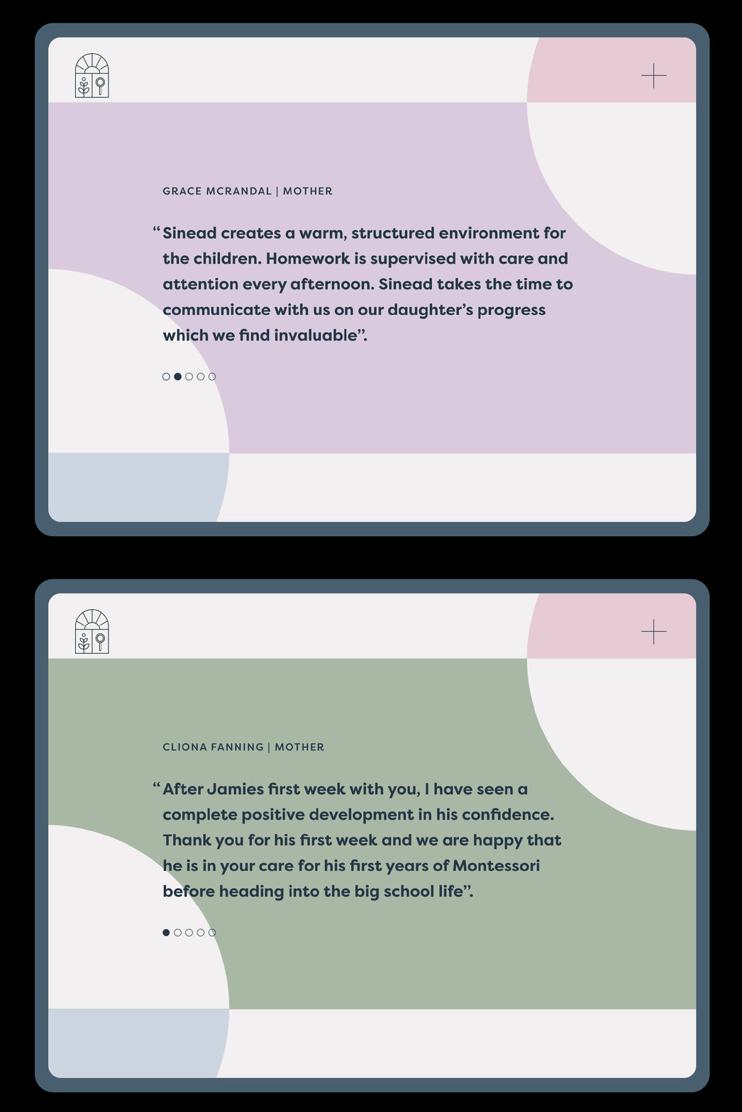
Screens from website


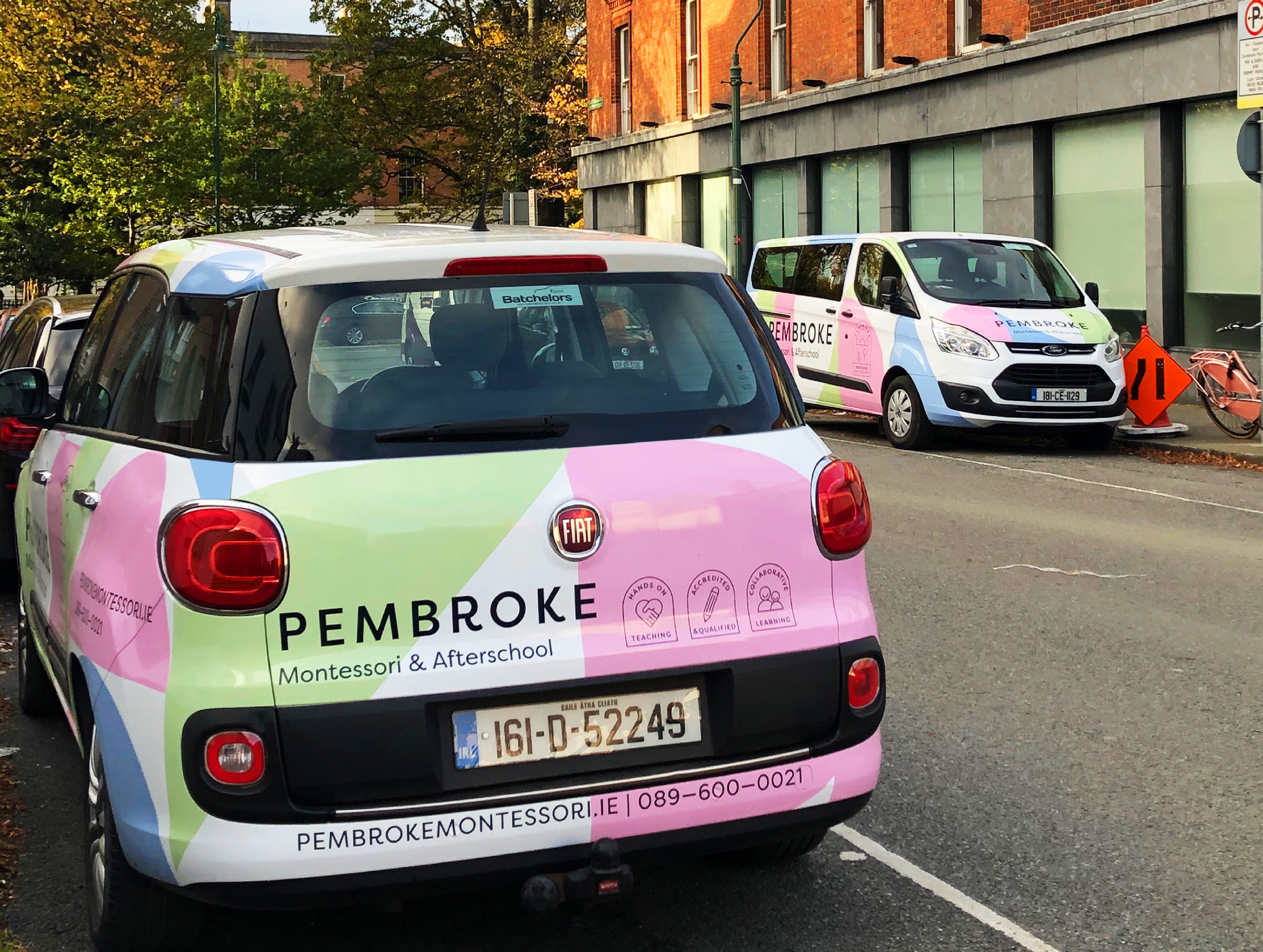
Car & Van Wrap

Social Feed
USP Badges


